I started with typography. Noto Sans and Noto Sans Arabic gave us one type family across both scripts, so headings, body text, and UI elements stayed visually consistent whether the page read left to right or right to left.
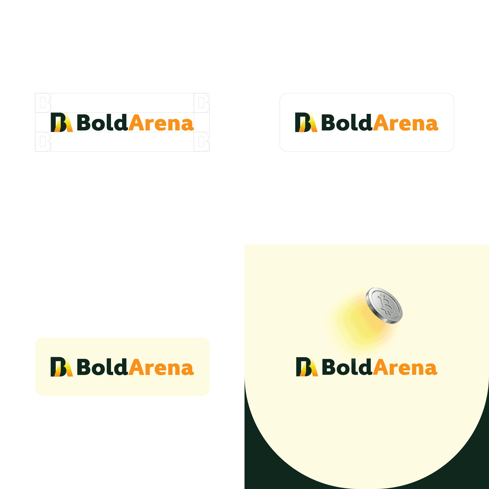
For the logo, I explored multiple concepts before landing on BoldArena: a mark built to scale down to a favicon and up to a hero banner, kept consistent across the LTR and RTL layouts.
The design system came next. I built primitives (the raw color palette) separate from semantic tokens (how those colors get used: primary, background, border, text, CTA). This meant the content team could apply "cta-primary" or "text-secondary" without ever touching a hex code. Spacing, padding, and radius all followed a 4px base scale, so nothing in the interface was ever eyeballed.
Bidirectionality was the core design constraint, not an afterthought. I built every card, tab, and button to flip cleanly between LTR and RTL, including directional icons and tab indicators. I organized the whole system into 102 Figma variables covering headers, hero sections, news cards, category tabs, and footer content, so any future page could pull from the same bilingual source of truth.